Match the widget to your brand
Set your brand colors, font and corner radius, and fine-tune the bundle builder's look.
 Attravo TeamUpdated 1 min read
A widget that looks like the rest of your store feels trustworthy, and shoppers buy from what they trust. All the brand settings live in one place and apply to every bundle.
Set your brand colors and font
- In the app, go to Settings. It opens on the Appearance tab.
- Under Brand, set:
- Primary color: your accent for buttons, progress and highlights.
- Secondary color: text and icons that sit on the primary color, like step numbers and badges.
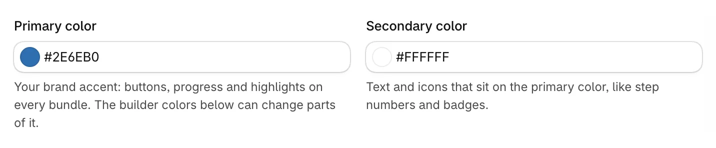
- Choose a Font family, or keep Inherit from theme to use your theme's font, and set the Border radius for how rounded cards and buttons are.

- Click Save in the bar at the top of the page.
The Live preview shows each change as you make it, and switches to the page the setting affects:
Your storefront picks up saved changes within about 3 minutes.
Fine-tune the bundle builder
The bundle builder on your bundle page has its own color and style settings. Leave a color on its default to keep the builder's own look, and change only what should match your brand.
- Under Bundle builder colors, set colors for Text, Step headers, Buttons and Discount progress. A color you set gets a Reset to default link, and Reset all to default clears them all.

- Under Bundle builder style, choose:
- Heading style: Capitalize Each Word, As written or ALL CAPS.
- Step heading alignment and Card text alignment.
- Text size, from 80% to 140%.
- Product image shape and Product image fit, so photos sit well in the cards.
- Show View product link on cards.
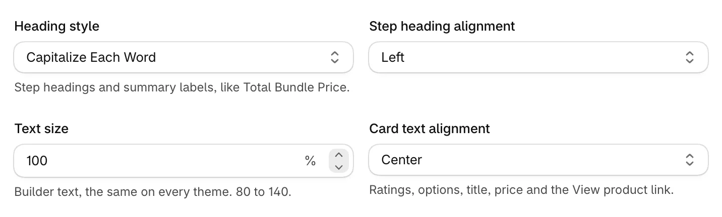
- Click Save.
Was this helpful?
More in Design
- Change the add to cart button and wordingEdit the bundle builder's button, choose where it takes shoppers, and rewrite the words they see.
- Show badges and star ratings on product cardsTurn product tags into badges and show ratings from your review app on the bundle builder's product cards.
- Turn on the progress bar and discount popupShow shoppers how close they are to the next discount, and celebrate each one they unlock.
- Customize the bundle pageAdd a banner, heading and trust points to your bundle page, and set its layout.