Check the cart on phones
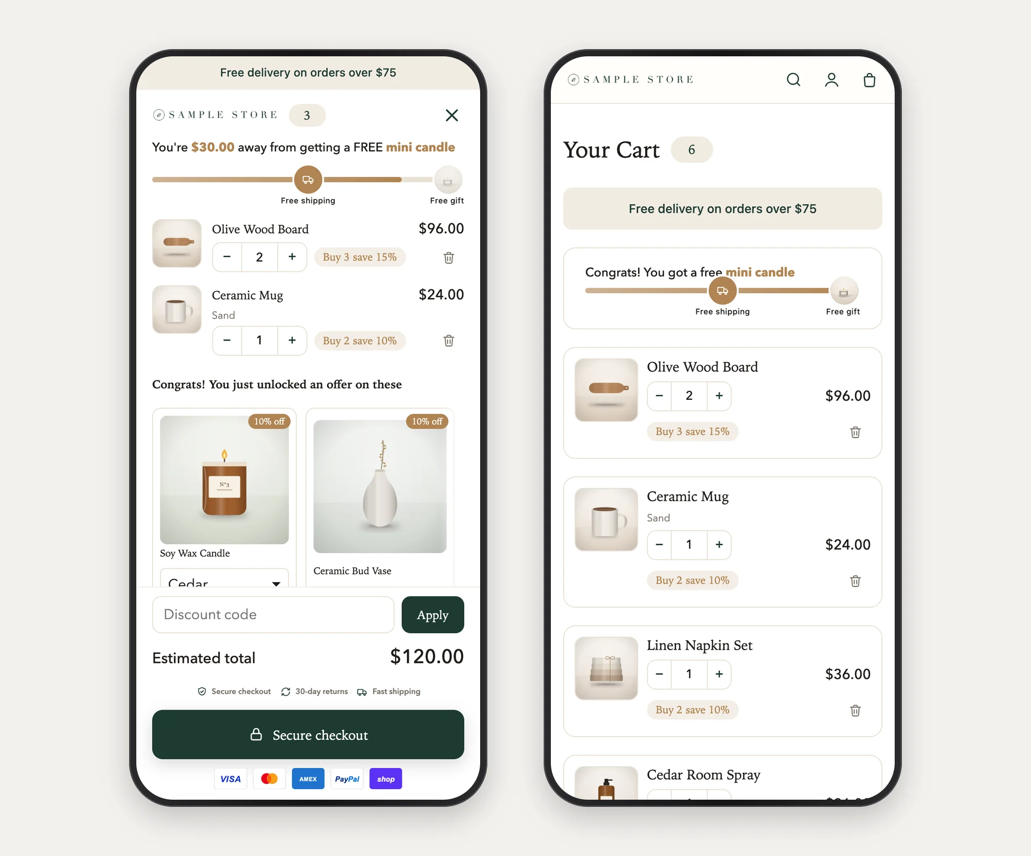
See how the drawer and the full cart page look on a phone, and what changes from a computer.
 Attravo TeamUpdated 1 min read
On this page
Most shoppers open the cart on a phone. The cart is built for it: the drawer fills the screen, and the full cart page stacks into one column.
Preview it
- On Cart settings, in Live preview, select Mobile. The preview opens on it.
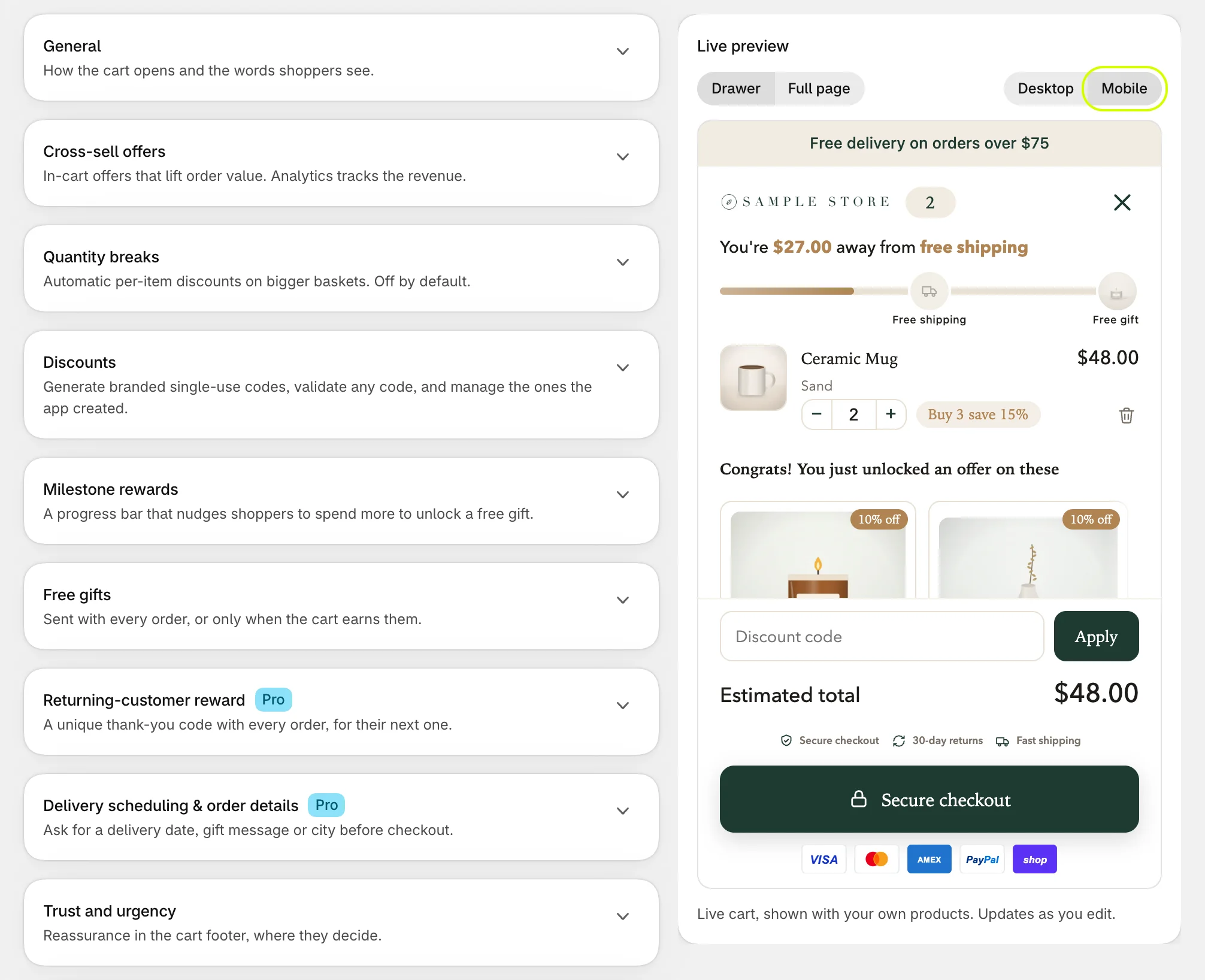
- Select Drawer or Full page to see each one.
The preview is a guide. Check your store on a real phone too: the setup guide's last step, Check the cart on your store, is there for it.
What changes on a phone
- The drawer opens across the whole screen, whatever Drawer width (desktop) is set to.
- The full cart page stacks into one column: the reward bar above the cart lines, then the offers and checkout under them.
- A floating cart button with text shows only its icon and count on narrow phones.
- Offers in a carousel scroll sideways with a swipe.
Keep it compact
A phone screen fills up quickly. If the checkout button sits far down, try these:
- Turn on Start the note collapsed for the order note.
- Choose Carousel for the offers, which keeps the feed to one row.
- Lower Product image size a little.
Was this helpful?
More in Design
- Match the cart to your brand colorsSet every color the cart uses, from buttons and the reward bar to text and the page dimming behind the drawer.
- Set fonts, corners and sizesUse your theme's fonts or one of the cart's own, and set heading weight, button depth, corner shapes, text size and widths.
- Reorder the checkout areaChange the order of the discount box, total, terms, trust badges, checkout button and payment icons at the bottom of the cart.
- Style the cart with custom CSSOn Pro, add your own CSS for the cart on your store, for the few details the design settings do not cover.